8 great fonts for vintage poster design
If you're looking to create a vintage style poster design (whether for travel posters as you'll find on this site or in the style of classic advertising) there are a few good rules to follow. You'll want to use sans-serif typefaces and put pretty much everything in upper case.
Unfortunately a lot of people creating these posters can ignore the type. The pages of Etsy are full of folk who have found just find one font (usually something like Futura or Gill Sans) and stuck with it for all their posters.
If you look into Art Deco or mid-century poster design (and classic railway posters for that matter) you can find a wide range of fonts were used to add personality, variety and visual interest. Below are a few examples.

So creating vintage posters can be a chance to explore the typography and there are plenty out there to find. I like using different fonts for different places/areas in my poster designs. Over time I've collected quite a few, for free or a small fee.
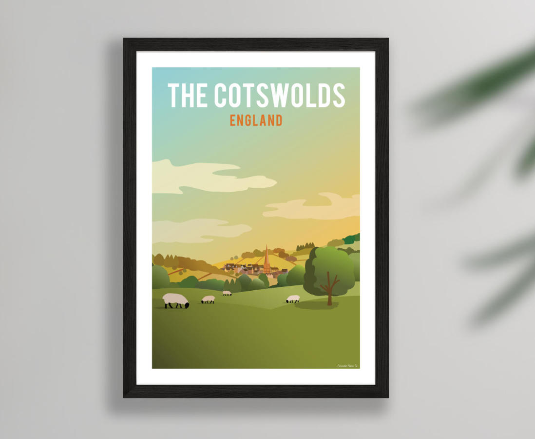
Here are some of my favourites which I've split into four categories: thin, bold (for the rounder fonts), industrial (taller fonts), and wide. They come with examples of posters where I've used them.
Thin
Champagne & Limousines – donation
An elegant and stylised font that brings a touch of class and an Art Deco feel. You can download it here.
Parking – €5
A narrow option with a few exaggerated and fun features – such as the N – which adds a lot of personality. Get it from Atipo, who are a great little typeface foundry.
Bold
Keep Calm – £15
It's almost a cliche, but if you're going to go for an early-mid 20th Century style then an obvious approach is to mimic the Keep Calm and Carry On poster. This font is based on exactly that and you can get it here. It's great for bringing to mind functional transport signage.
The Bold Font – free
For something a bit more heavyweight and with a bit less of a rigid style, consider The Bold Font. It's like a cross between Keep Calm and Champagne and Limousines. You can download it here.
Industrial
Bebas – free
Similar to the classic and popular DIN, this taller typeface really brings a clear poster aesthetic to the point where I use it in my logo and for all the sub-lines in the posters.. The letter spacing in the free version isn't great but I kind of like that it needs a bit of adjusting, adding an element of traditional hand-design to the process. Get the free version here or buy all the weights here.
GoBold – $20
This typeface comes in a massive range of styles (some of them quite funky) so you can use it in lots of different ways. A bit of characterful variety exists in the letterforms throughout. Buy it here (there's a small grey link to get just this one font).
Wide
Phosphate – free with MacOS or £40
Sometimes people can assume classic poster type is very elegant but a surprising number of poster designs feature really chunky lettering to stand out and make a big impact. This is a great one for that effect and you can buy each weight here – though I find the inline style too gimmicky.
Chaney – €10
Atipo foundry have several great vintage-inspired fonts. This one is like the opposite to Parking (above) with very thick lettering and weights that go super-wide to bring to mind hand-stamped type. Get it here.


