Great vintage British railway posters – 7 of the best
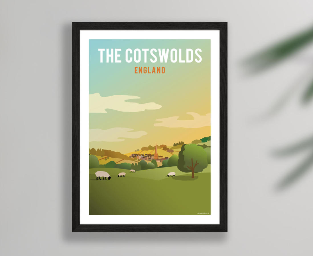
The posters I create on Cotswold Poster Co are obviously influenced by the golden age of railway poster design (from the 1930s-1950s). Even if the styles are somewhat different – with mine more of a cleaner-edged, modern take – if you put bold type over any rural scene it instantly evokes this period.
I decided it was time to have a dig through these classic designs and pick out some of the best examples of poster art – for that era or today. So here are 7 of my favourites that are the most effective and show the qualities I look for in a strong poster...
Ross-on-Wye by Reginald Montague Lander (1935)
Let's start with the classic type of image you'd see in so many railway posters: a picturesque rural location made vivid with bright colours. I like this one more than the average because it's so boldly screen printed, with simplified straight lines for the buildings and curved shapes for the trees. Plus the typeface is more elegantly stylised and Art Deco than most.

Peak District by S R Wyatt (from some time between 1923-1947)
This poster is a real epic, creating the feeling of peering over a ledge down to a valley with towering hills in the background. Contrasted against that are the hero elements: the simple shapes of the man-made viaduct and train right in the middle. I wasn't aware of this poster when I created this GWSR design, but it is a similar idea.

Snowdonia by Charles H Baker (1933)
For me, great poster design is all about representing something in the simplest form possible and with the fewest lines. This Snowdonia poster more than achieves that with the grand mountain filling most of the image but it is elevated by the rays of sunshine shining on the hills in the foreground to create real depth. It truly sells the great outdoors, with only a hint of human life in the bottom left corner.

The Yorkshire Coast by Frank Sherwin (1950s)
This British Railways poster of Robin Hood's Bay is from a later date than many of the classic posters and it could easily be just another generic rural idyll. However it is elevated with a strong sense of scale and depth and a rainbow of colour. The buildings fill the foreground, the inviting beach arches away through the midground, to the cliffs and clouds in the background. It manages a bit of every landscape in one.

The Queen of Scots by Reginald Mayes (1950s)
Here we have a poster that makes the locomotive the star rather than a location. It is an example of really strong perspective where the train disappears to a point to create dynamism (something I aimed for with my Kemble station design) and aided by blurry lines to indicate speed. Having the tartan pattern fill half of the design was probably unnecessary though!

South for Winter Sunshine by Herbert Edmond Vaughan (1929)
This poster is the oldest design in this selection but probably the most fun. It avoids being literal and showing an actual location but features a minimalist train, simple angled shapes and creative use of typography to make something really eye-catching. Those sharp lines and contrasting colours would have livened up any train platform.

The Peak District by Ralph Mott (around 1935)
A second visit to the Peak District and a much more atypical, creative effort. A dark rocky outcrop dominates most of the poster but it creates a dramatic sense of scale, helped by the people sat atop it, almost out of shot. It is also enhanced by the brightly coloured background of fields giving depth and the fun, bold lettering.
