The best Art Deco posters – a top 10
I recently buried myself in the book The Art Deco Poster by William W Crouse – a big coffee table book that celebrates this golden era of poster design. It showcases designers in the 1920s and 30s who were pushing the medium to create drama and excitement, often with only a few elements.
When done well, it showcases the ideal that I aim for when creating a new poster design for my range: the clearest version of the place without distracting detail, drawing you in to take notice of the subject.
With a book like this it's easy for the mass of options to wash over you but the more I studied them the more I found to appreciate, so here are my top 10 favourite Art Deco posters from that book. They are arranged in no particular order and with a line explaining why I think each works so well.
Aeroput Jugoslavija by Hans Wagula (1930)
An elegantly clean night/day comparison between two modes of transport. Still looks like a modern illustration style today.

Cie air union lignes d'orient by Jean Olivier (1929)
A great piece of minimalism, showing what can be achieved with a few straight lines – just the spacing of them creates a sense of distance. I would love to find a subject where I could distil it to something this simple.

Donnet by Alexey Brodovitch (1925)
This design manages to be very atmospheric and to convey wealth through a couple of silhouettes. A characterful typeface in a bold colour makes the brand clear too.

Delahaye by Roger Perot (1932)
Great position and perspective to show the car bearing down towards you. Really strong font and putting a slight angle in there helps create more dynamism and movement – this is an approach I took with this design for the Gloucestershire Festival of Polo.

Austin Reed: 13 Fenchurch St by Tom Purvis
This design turns the figure of the man into something epic and giant-like. The great lighting really brings it to life without the need for facial features.

Cordial Campari by Macello Nizzoli (1926)
The saturated colours and a the dark surroundings really help the subjects of this still life stand out and add a sense of class. Great combination of three different fonts too.

Normandie: Voyage Inaugural by A M Cassandre (1935)
This is a classic (and on the cover of the book) and can't be beaten for creating impressive drama and over-sized scale – Cassandre was a poster design genius and really utilised all the space available.

Exactitude by Pierre Fix-Masseau (1932)
Essentially a few simple lines and shapes come together to create this powerful train poster. Created by a designer who worked in Cassandre's studio so it shares that dramatic perspective style (see above).

Ski at Lake Placid by Sascha Maurer (1938)
This is a really fun way to bring the type into the 'real world' and to create a clear message where it works together with the illustration. Playing with perspective and position is always a great way to create interest, as this does by going for an aerial view.

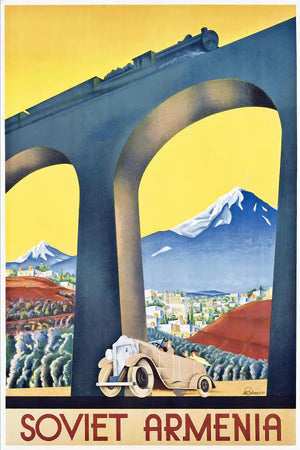
Soviet Armenia by Anonymous (1929)
In this poster the old and natural in the background contrast with the newer technology in the foreground. The exaggerated viaduct frames the shot and elevates the train over the mountain. I've played a bit with viaducts for drama such as in this Stroud poster.