7 of the best London transport posters
Classic British railway posters have been an obvious influence in the designs I create for Cotswold Poster Co, I should also acknowledge the inspiration from Transport for London's long history of brilliant poster art. The trains, Underground, and bus network have been run by various companies down the years but for at least the last 100 years they have understood the importance of great poster design to inspire people to visit places around the capital (and use public transport as they do so). They can also be a bit more abstract and stylised and not just focus on depicting place in the way that the railway posters did.
Here are a few of my favourite posters that have appeared across the network over the years – hopefully you may not have seen one or two of them before...
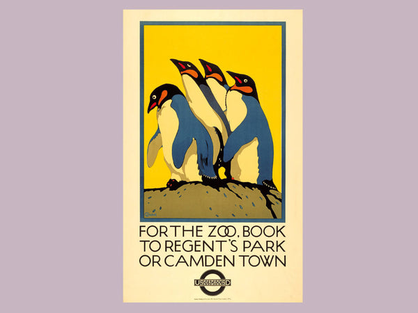
London Zoo by Charles Paine (1921)
The zoo has long been a source of great posters for TfL and this classic is just an elegant illustration that you can't help but be drawn to. The penguins themselves remind me of the iconic publishing house logo in their graphic style, and the bright yellow helps the whole thing pop. The type is very satisfying too.
Winter Sales by Edward McKnight Kauffer (1921)
Despite being American, Kauffer was one of the most important graphic designers in Britain, particularly thanks to his work with London Underground. He often did more traditional landscapes but this design showcases an abstract approach, creating a stylised invocation of London weather and the shapes that appear when the umbrellas come out. The Underground was often depicted as a refuge from the elements.

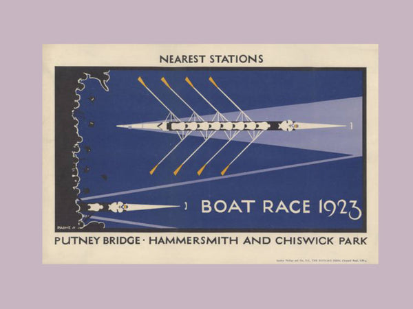
Boat Race by Charles Paine (1923)
The famous Oxford v Cambridge boat race on the Thames is a topic tackled by several London Underground posters, especially in the days where it drew big crowds. For me, this one is the stand out, taking a view from above to make the unmistakable shape of the rowing boat into the star. A minimalist and modern approach using mostly geometric shapes and one flat colour.
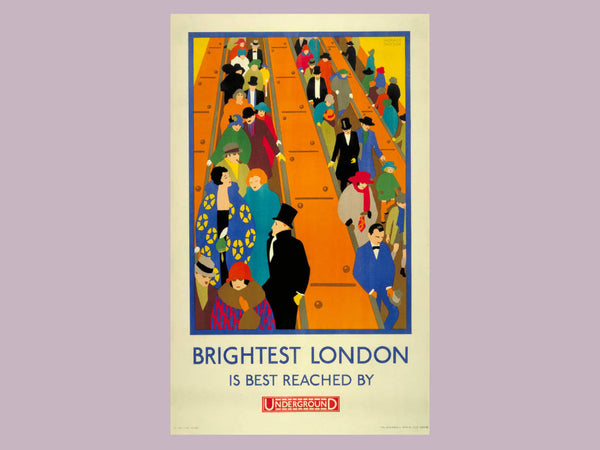
Brightest London by Horace Taylor (1924)
This is an absolute classic and really invokes the essence of what it must have been like to be going out on a lively night in glamorous central London in the 1920s. It matches up to the word 'Brightest' as it features lots of colours – in a time when many posters would have only used one or two.
Watch/Roundel by Hans Schleger (1935)
The London Underground logo (the roundel) is repurposed in lots of posters down the years, sometimes in quite bizarre ways that don't always make sense. I think it feels most natural as a wrist watch, as it simply and effectively makes a point about the speed and punctuality of the service.
Rush Hours by Victor Galbraith (1959)
This poster is a lot of fun and is full of personality, making its point with several unhappy looking cut-out style commuters packed into a minimalist bus. The horizontal chaps are particularly enjoyable, to really bring home the uncomfortable nature of rush hour travel. The roundel also pops up in an understated way here too.

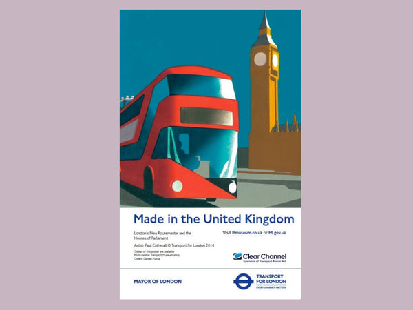
Routemaster Bus by Paul Catherall (2014)
Whilst there have been many great designs in recent years this is a modern entry that harks back to the history of TfL's poster art. Paul Catherall's linocut style is generally superb – focusing on light and shadow to show places and buildings in an iconic way – but it is particularly well used here. It promotes the new Routemaster bus and this style instantly helps the vehicle feel like a London classic, particularly when placed alongside Big Ben – the most famous symbol of the capital.