The design story: Cirencester
There are three designs of Cirencester in the Cotswold Poster Co range. They were all created fairly early on, in 2019, as being such a central town in the Cotswolds (and one that is only growing bigger) it needed representation. It was also where I grew up so I had to do the location justice!
The most obvious and recognisable view of Cirencester is the church in the marketplace but the first I did was in fact the design of Cirencester Park. I was interested in trying something simple, inspired by Art Deco posters that manage to do a lot with only a few lines and shapes. Of course it features the parish church too, as so many views in Ciren do – for somewhere in the Cotswolds Cirencester is actually pretty flat and so you can see the church from everywhere around the town centre.

The view down the gentle slope of Broad Ride in Cirencester Park offers something iconic, with the path leading the eye to the church in the distance and the trees framing the view. I thought it would be good to make it a late afternoon/evening view so the Cotswold stone of the church would be warmly lit on the horizon. The gradient of the sky also leads the eye to that single focal point.
It’s probably the most stripped back poster I’ve created but that is something of a holy grail in poster design – creating the most impact with the fewest elements!
After this I had to tackle the most recognisable view of Cirencester – that of the parish church in the marketplace. I did wonder whether to show a market set up in the town but within the limits of the portrait poster format I decided I had to include things to the right hand side of the church, and the colourful shop buildings of the marketplace. Those buildings also offer some perspective and guide the eye to the main attraction of the church tower.

Since the launch of this design in 2019 it has remained the bestselling poster and the no.2 bestselling card, which shows I must have got something right! I think it works because it manages to be highly recognisable and lively without being too complex.
I liked the idea of making a trilogy of Cirencester designs and thought it would make sense to show another distant view of the church (to highlight that point about the church being viewable from so many places in the town). Browsing through Instagram it was photos of the view from across the lake in the Abbey Grounds park, behind the church, that I liked the most. This offered something different in featuring a body of water, as the town doesn’t have a prominent river through it and I kept the style quite stripped back, like the Cirencester Park one.
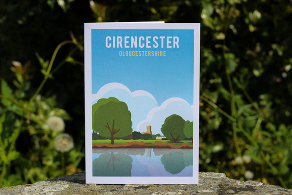
The three designs work well as a trio with the marketplace view in the middle and the distant views of the church from the parks either side. They are always popular when I sell these three as 5x7 inch prints together in a frame at markets. It was presenting them like this that made me change the second line of text on the Park and Abbey Grounds to give their location rather than repeating 'Gloucestershire' on all of them.

I revisited the church and marketplace design in a limited edition poster, changing the setting to sunset and introducing a fiery orange glow into the sky. This also gave me a chance to saturate the colour of the buildings to give that late-in-the-day light effect.

Finally, if you do want a design of the centre of Ciren on a market day then take a look at Elaine Kemp’s great watercolour design, which is stocked at Cotswold Poster Co.
It’s been a while since I’ve done a Cirencester design now and it could be time to add another to the collection but I’m not sure what location makes sense next. There aren’t too many major landmarks but perhaps the ‘castle’ or one of the old lanes such as Coxwell Street. Let me know if there’s something you’d like to see!